Majors Project
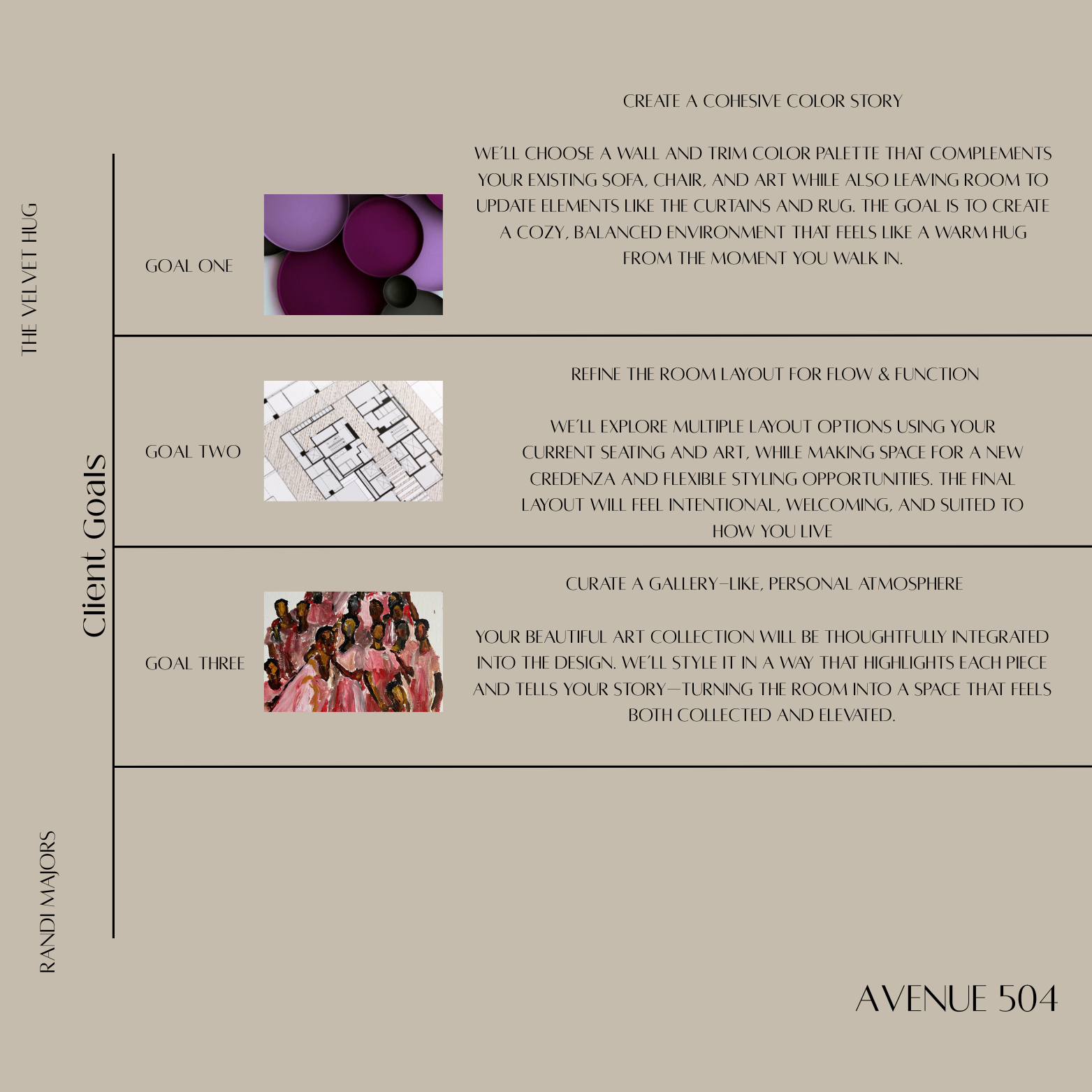
CLIENT GOALS
Here’s a quick recap of the goals we discussed for your space — what you want it to feel like, how you plan to use it, and the overall vibe we’re aiming for. Take a moment to review and let me know if there’s anything you’d like to add or adjust!
Color Palette Suggestions
Revision


CONCEPT
REVISIONS
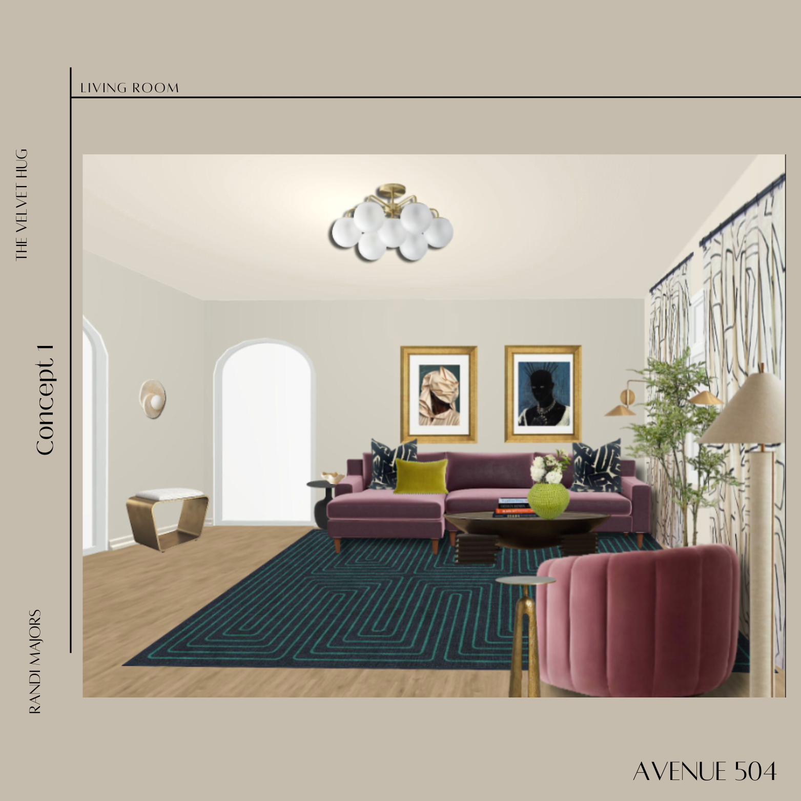
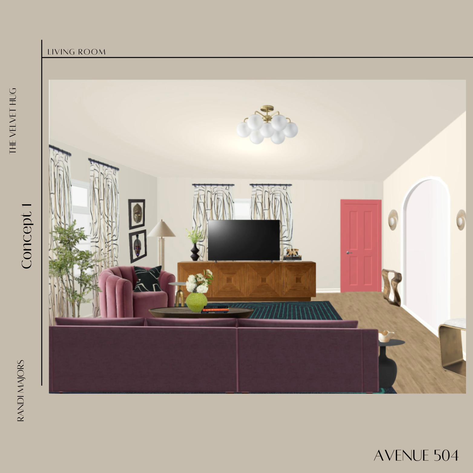
CONCEPT 1: DESIGN RATIONALE
For this revision, I explored a few color options and ultimately settled on Benjamin Moore’s Blue Note. This shade brings depth and richness to the living room while blending beautifully with the cream walls and the rust tones in the stairway. Carrying the same color onto both the ceiling and the archways adds architectural interest and creates a cozy feel, while still allowing your existing lighting to remain in place and complement the space.
The coffee table and end table were selected in a lighter finish with warm brown veining. These tones connect with the wood of the media cabinet while adding brightness and balance against the darker ceiling and bold curtains.
Rather than mounting the TV on the wall, the media cabinet has been kept freestanding. This leaves the layout flexible for the future so you can make changes without committing to a permanent setup.
For lighting, there are two wall sconces placed near the media cabinet to provide ambient glow and balance, along with one sconce in the corner near the sofa. That corner sconce highlights artwork and creates another layer of cozy light in the seating area.
I also made sure to keep the details you loved from the first concept. The pillows on the sofa remain as strong accents and reflect your personality, while the artwork above the sofa still anchors the space and speaks to you personally. The rug with its sense of movement ties everything together, echoing the blues used throughout the design and creating harmony across the room.
The chartreuse curtains serve as a bold, unexpected pop of color. Against the cream walls and wood cabinet, they create a lively backdrop that works in harmony with the sofa and chair while complementing the deeper ceiling tone.
Finally, the design incorporates thoughtful details. The dog bed, chosen in a fabric reminiscent of the textile you sourced from Africa, adds both function and personal meaning while blending naturally into the color palette.
I’ve included two perspectives of the space so you can see how all the elements connect. I’d love to hear your thoughts on how this direction feels and if there’s anything you’d like me to refine further.
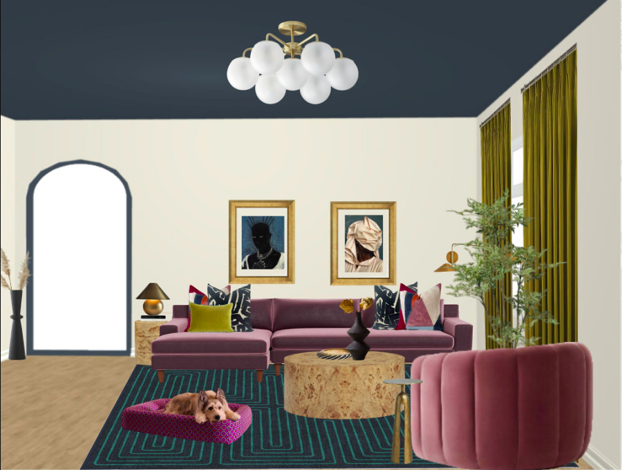
CONCEPT 1: SOFA VIEW
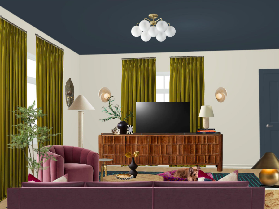
CONCEPT 1: DOOR VIEW
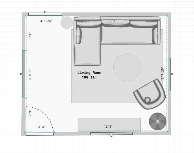
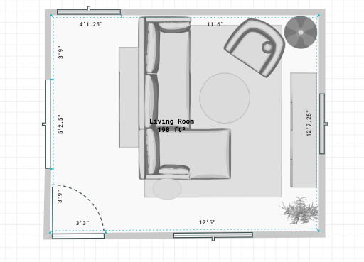
LAYOUT 1
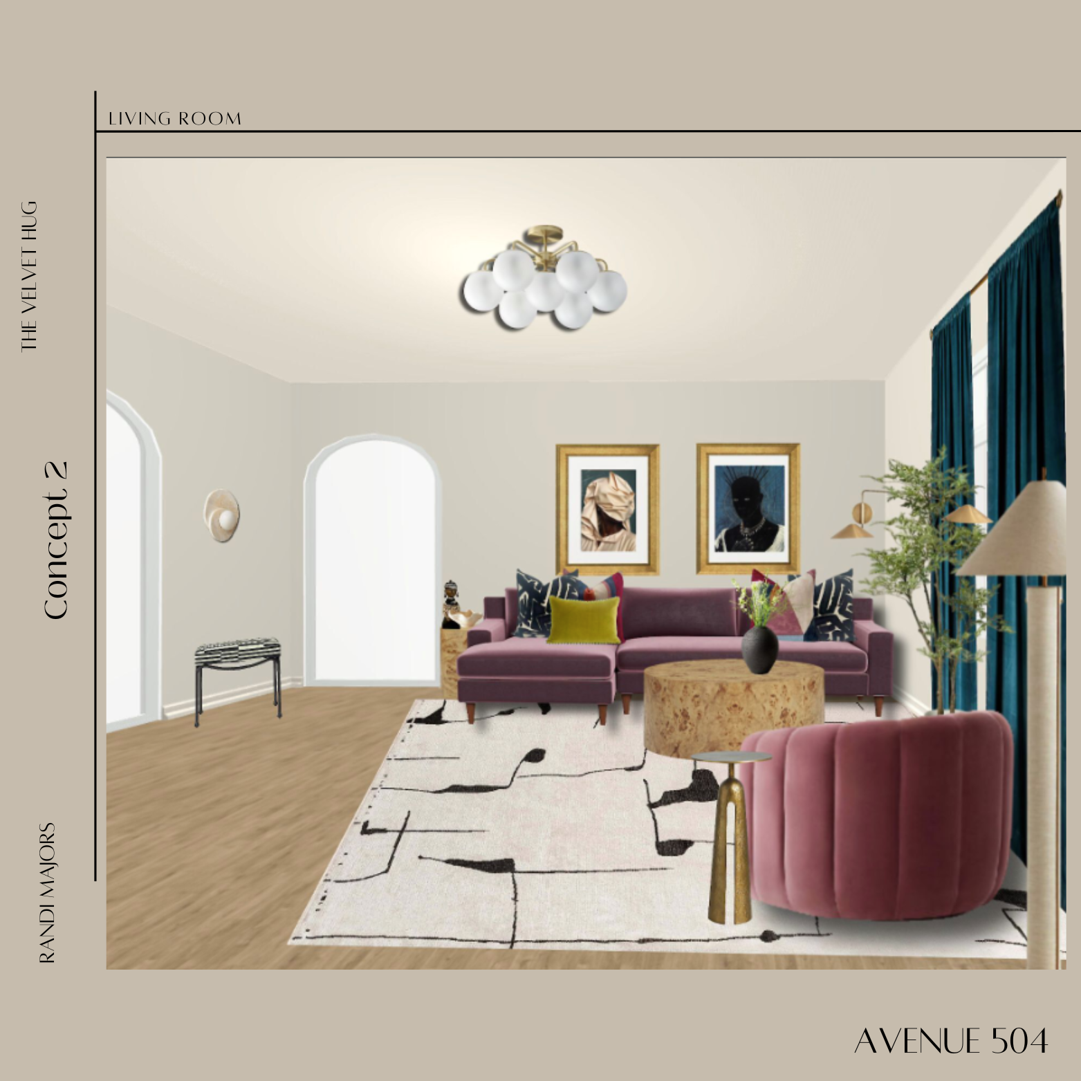
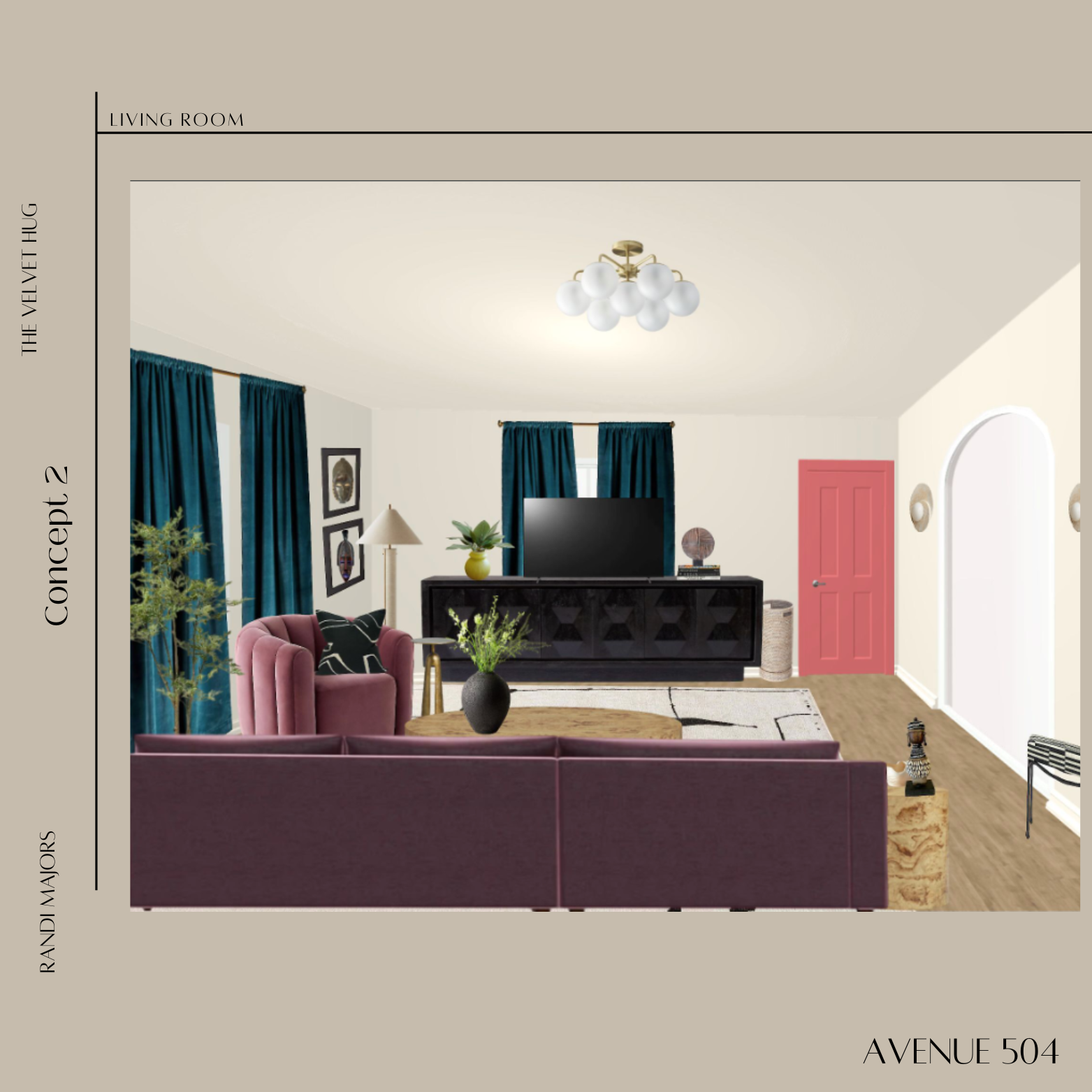
CONCEPT 2: DESIGN RATIONALE
This concept leans into a cozy yet functional layout while also creating a subtle sense of entry, since the living room sits right at the front of the home. For this version, the walls are painted in Benjamin Moore’s Intrigue with a crisp white ceiling. The color is both warm and airy, pairing beautifully with the existing teals, blues, lavender, rose, and the rust tone in the hallway.
To ground the space, I introduced a bold black-and-white area rug that feels modern and graphic while being stain-resistant and durable for high-traffic living. The burl wood and dark-toned media cabinet anchor the room, with a matching side table added to tie the tones together. Behind the sofa, a sofa table doubles as an entry point, offering a functional surface for keys, lamps, and accessories.
For lighting, the travertine sconces were relocated to the walls flanking the dining room, giving that passage more presence and flow. A new ceiling light fixture in the same tonal family was added, but with more texture, creating subtle visual interest overhead.
Instead of velvet, we layered in full silk curtains. I think they still feel luxurious but also add movement and softness, bringing in a different texture that complements the bolder rug.
The artwork shown is a placeholder to give a sense of scale and impact. Depending on your own pieces, we could explore a mix of black and gold frames for contrast. The combination of African textile pillows from your travels, the Kelly Whistler graffito-inspired pillows, and the mix of different wood finishes makes the room feel eclectic, modern, and deeply personal.
This concept also thoughtfully leaves all vent areas open for better airflow throughout the room. The paint color, Intrigue, keeps things grounded but airy, enhancing the natural sunlight that already fills this space.
We’ll also provide additional options for rugs and TV consoles so you’ll have flexibility in finding what feels like the perfect fit.
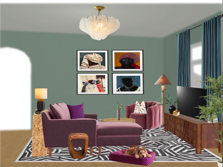
Concept 2: Sofa View
Layout 2
MOOD BOARD
This board gives you a first look at the overall mood, colors, textures, and inspiration behind your design. It’s meant to capture the feeling of your space before we dive into specific pieces. Love it? Not feeling something? Feel free to share your thoughts by text or email.

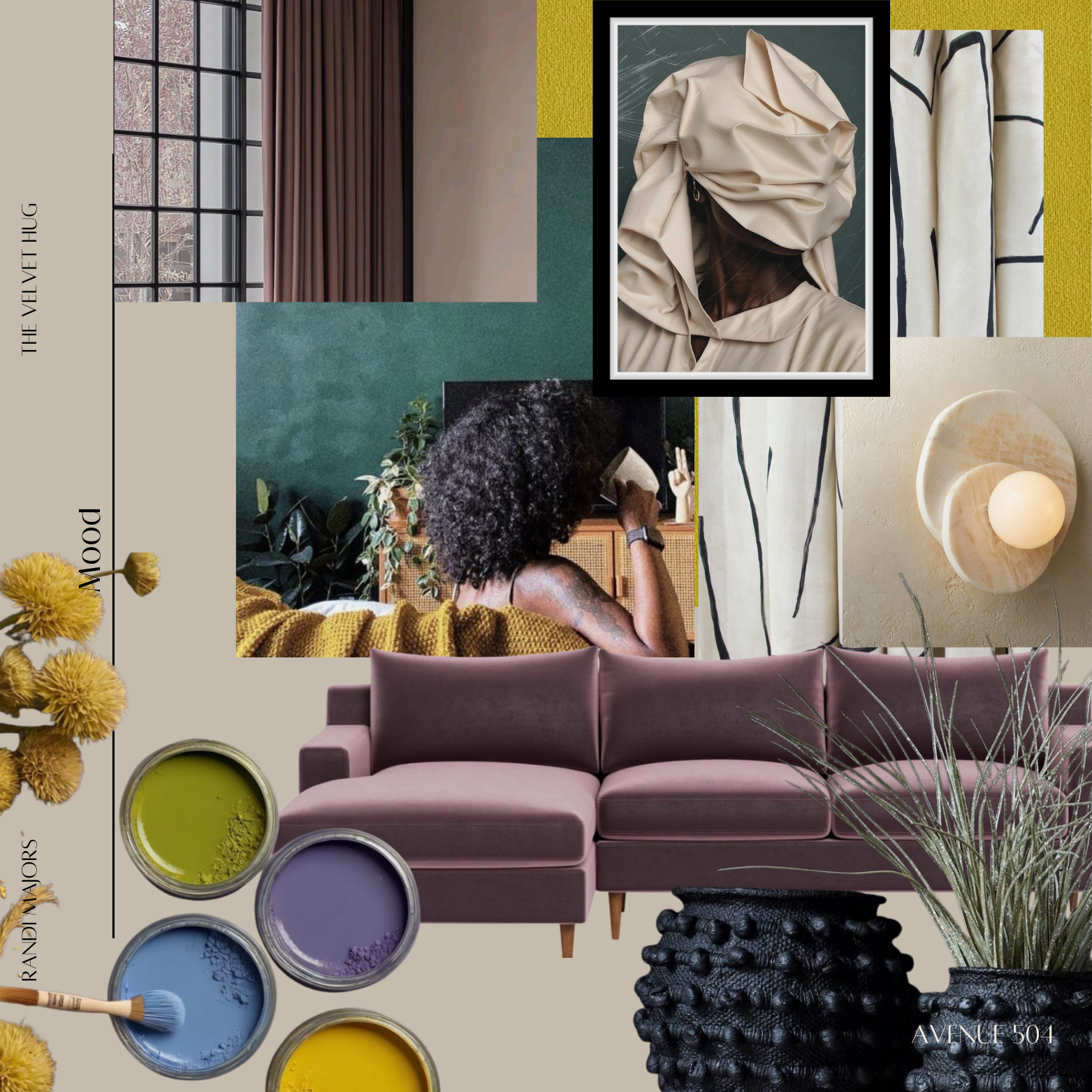

MATERIAL PALETTE
Here’s a collection of colors, fabrics, finishes, and textures for your project. This helps set the tone and visual foundation for everything
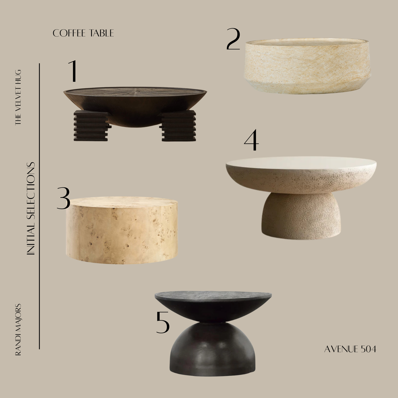
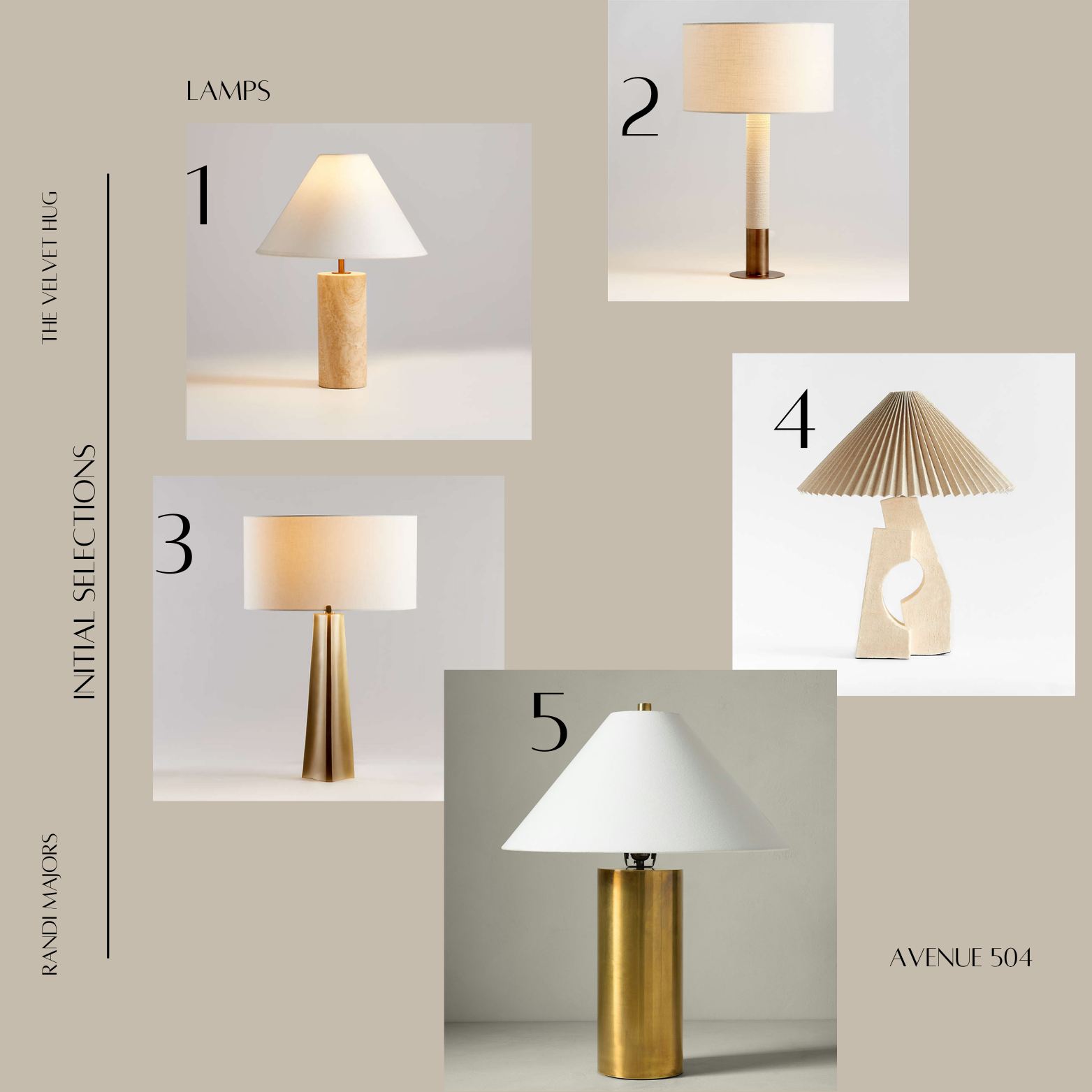
INITIAL SELECTIONS
These are a few handpicked pieces to test out which style direction you’re feeling most connected to. They give us a starting point to see what makes you say “yes, that’s it!” or “let’s try something else.” Take a look at the shapes, colors, patterns, etc. and let me know what you love, like or dislike about these pieces.
CONCEPT
Think of this as your space starting to take shape — a curated mix of furniture, decor, and style elements that reflect the design direction we’re heading in. I’d love to hear what stands out to you, what you’re drawn to, or if there’s anything you’d like to see tweaked.